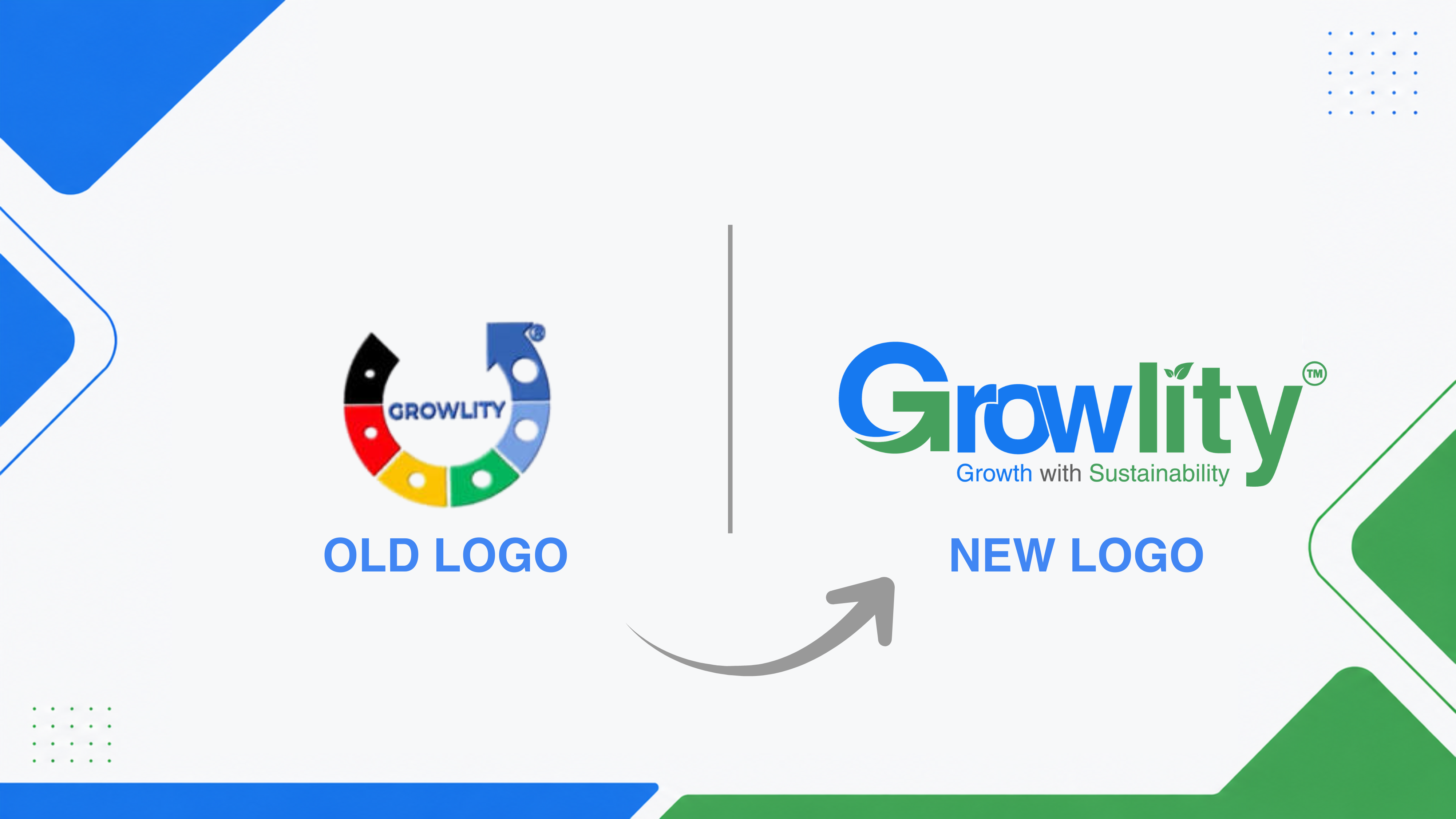
We’re excited to introduce our new logo, a powerful symbol of our core values and vision for a sustainable future. Each element and color of the logo is thoughtfully crafted to tell our story:
- ➡
Growth – The “G” features an arrow, symbolizing upward momentum, progress, and the continuous growth of our clients and mission.
- 🌿
Sustainability – The dot on the “I” is replaced with leaves, representing our commitment to nurturing the planet and fostering eco-conscious solutions.
The Colors Speak Too
- 🔵
Blue represents trust, reliability, and the solid partnerships we’ve built with over 150+ clients worldwide.
- 🟢
Green signifies sustainability, innovation, and our dedication to creating a healthier planet.
Leadership Perspectives

This logo embodies the essence of what Growlity stands for: progress driven by trust and rooted in sustainability. It reflects our unwavering commitment to empowering organizations worldwide to make a meaningful impact.

As we expand our reach in global markets, this refreshed logo is a symbol of the trust and confidence our international clients place in us. It reinforces our commitment to driving sustainable growth and creating lasting value in diverse regions.
This transformation is more than just a design change — it’s a promise to continue innovating, growing, and delivering excellence in ESG and sustainability consulting.